

BY: Pietro Marino
There’s nothing quite like Spooky Season, aka October. Besides it being the birthday month of Yours Truly, October provides us with brisk days, colorful fall foliage, and of course, Halloween. The spirit of dressing up and costume contests got me thinking…what are best jerseys (and uniform sets) Tribe football has worn over the years?
It’s no tricks and all treats for my personal top five William & Mary football jerseys of all-time. Keep in mind this is purely based on my own (biased) opinion, and I’d love for you to share your favorite Tribe look over the years in the comments or on social media! Also important to note: this list is heavily based on my ability to actually find pictures of jerseys from specific eras. If there’s a particular look (or era) you think I missed, it’s more than likely I just wasn’t able to find pictures of said jersey or look.
With that out of the way, let’s dive into it!
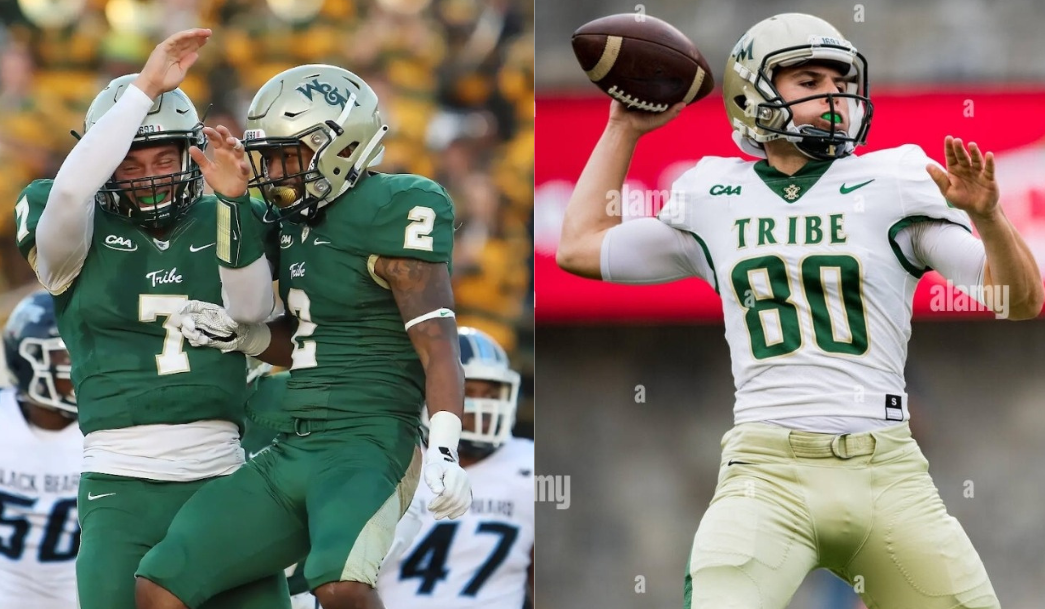
5. 2024 UA Green & Gold Set

Rounding out the Top 5 is the newest jersey on the list, and one that has steadily grown on me the more I see it in action.
Why it works: Would you be surprised to know that throughout my entire research on, key word here, William & Mary football jerseys, I could only find William & Mary on the front of the jersey crest one other time?
In 2019, all of Tribe Athletics switched from Nike to Under Armour as their uniform supplier, and the football team got two new jerseys for UA’s inaugural season. The white away jersey, shown below, was the only other jersey I could find with “William & Mary” on the front.

Lots of moving parts on that jersey, and what’s up with the polka dots on the shoulders? But Under Armour kept at it, and the most recent batch of Tribe Football jerseys are a noticeable improvement, and there’s a very simple reason why.
Someone inside the Athletics Department had an epiphany about 20 years in the making: “W&M Gold” makes for a rather drab color on a football uniform, while “Spirit Gold” is the true gold color to be used for Athletics.
Wait, what the hell do any of those words mean? Well, according to the official William & Mary brand guidelines, “W&M Gold” is part of the University’s primary palette, while “Spirit Gold is often used in an athletic context to represent the university with bright, bold color.” Their words, not mine!

“W&M Spirit Gold” (left) compared to “W&M Gold”
That last part is particularly interesting, because sometime around the turn of the 21st century, Athletics uniforms ditched the Spirit Gold in favor of its much toned down counterpart.
Thankfully, that trend seemed to have ended, and Spirit Gold is back where it belongs, on the gridiron! The numbers pop considerably more with the Spirit Gold outline, and can’t lie, I do like how “Tribe” takes the place of side stripes on the pants.

What can be improved: This is a bit of a nitpick, but if we’re ranking jerseys, everything’s gotta be fair game. If you ever wondered why the Home & Away collars of the current football jerseys look different, it’s because they are two different jersey templates from UA. The Green Jersey is the UA “Big Win Football Jersey,” while the white is the UA “Vortex Football Jersey.”

To me, the collar on the “Big Win” jerseys, particularly the line that extends across the chest to the shoulders, sticks out in a bad way. In the end, it’s not a deal breaker to me because you 100% cannot see this while watching the game, but honestly that makes me question why it’s there even more. Other than that, I truly believe this to be a modern classic that takes the current brand of Athletics and properly infuses the proper Gold that was so iconic in the past.

4. 2018 Nike Vapor Untouchable Away Jersey
While there are slight variations year-over-year, Nike dominates the college football jersey landscape. 62% of FBS schools are supplied by the Swoosh, and for good reason, they have made some of the most iconic looks in CFB history.
I’m going to be honest though, Nike’s tenure as Tribe football’s uniform supplier was pretty underwhelming. A big reason why has already been mentioned above; Nike’s time coincided with the “W&M Gold” era of uniforms. Another unfortunate jersey development during the 2010’s was Nike’s “Flywire Collar,” you know, that weird layer of quasi-film that was plastered around the collars of NFL and college teams starting around 2010. For every jersey color not named white, this collar stuck out in the worst way possible (although Nike found a way to make it stick out on W&M’s white).

Why jersey suppliers have an obsession with ruining the collars of their jerseys, I’ll never know!
But enough about what Nike didn’t do right, and let’s turn our focus on their swan song jersey in 2018. This was the last season before Athletics turned over to Under Armour to be the new jersey sponsor, and let me tell you, Nike went out with a bang.

Why it works: The upgrade from the Flywire collar abomination to Nike’s Vapor Untouchable one cannot be overstated. For starters, they smartly ditched the shield around the Cypher so you could actually see it. The updated W&M crest on the helmet looks sharp, and you’ll notice on the front of the helmet is a subtle “1693.” For a seemingly simple looking jersey, the nods to W&M iconography are smartly incorporated throughout.
Where this jersey really shines for me is the front crest. No more barely legible Tribe script; this is a pretty bold jersey choice that sometimes falls flat on its face (see ATL on the Falcons current jerseys), but here, I really think it works.

Nice front view of the “1693” and updated collar with the cypher.
The old Tribe script has always looked great on a helmet but it was wonky on the front of jerseys. The bubble font got too scrunched up in my opinion, and from a spectator’s view I doubt anyone knew what it was anyway. In the few pictures I’ve shared of the 2018 jerseys, you get a great sense of how much more “Tribe” sticks out.

What can be improved: I ragged on W&M Gold on Athletics jerseys for #5 and to avoid sounding like a total hypocrite, I need to do it here as well. The pant colors need to be inverted, with green taking the primary spot and the W&M Gold demoted to the side paneling. The numbers use green text with W&M gold outline accents, so let’s keep it consistent and I think the white jersey base would pop even more.
I’m also not the biggest fan of the number font, but I can understand the change. Block numbers would have clashed with the new TRIBE wordmark on the front.
This jersey will probably be the most “controversial” choice here, but I think the switch to the Vapor Untouchable jersey template opened up a lot of new possibilities. I would have loved to see where Nike would have taken a home version of the Vapor Untouchable, because for whatever reason they were actually the Flywires, block numbers and all!
Same season, different Nike templates.
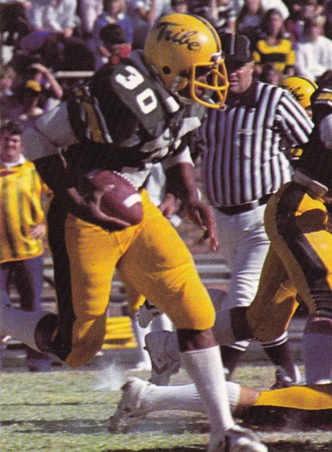
3. 1972 Green & Gold Set

Why it works: Sometimes, less is more. This is just a very classy look, with the traditional block numbering and shoulder stripes. One might say this is just the Green Bay Packers home set (and honestly they wouldn’t really be wrong).

What can be improved: What you can’t see in the single picture of this jersey is the helmet, which apparently looks like this.

I don’t know if it’s just the natural discoloration of the helmet or the lighting, but the yellow seems off to me compared to the yellow on the jersey and pants. Also, this is by far my least favorite W&M decal as it’s just really uninspiring and bland. It’s not bad, just forgettable.
As for the jersey itself, there isn’t too much I would change except maybe moving the shoulder numbers up so they aren’t right next to the stripe. Other than those two points, this is a pretty timeless look and one you can’t really go wrong with, although #2 will show how some small changes can improve upon this style.
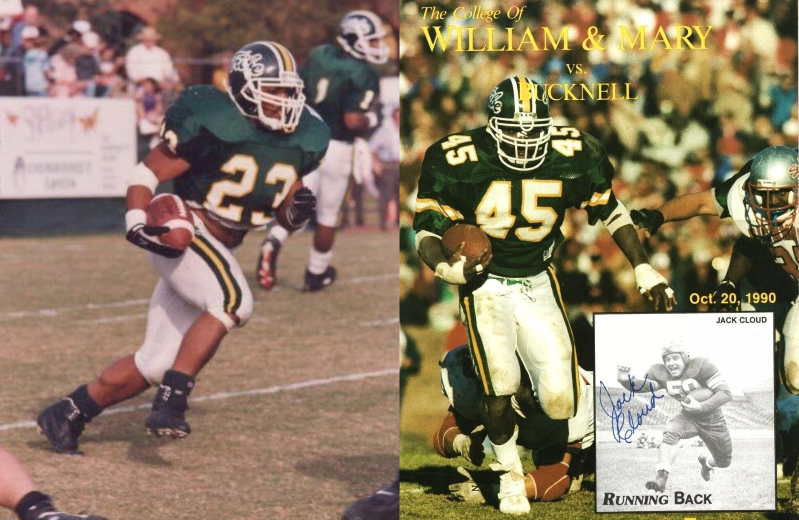
2. 1979-1982 Green & Gold Set
All things considered, this isn’t that much of a radical difference from the ‘72 jersey, but the small changes make a marked improvement.
Why it works: For starters, both the Tribe script and feathers decal are much better than the extremely basic WM helmet decal from 1972. Plus, the yellow being the largest shoulder stripe as opposed to the white looks a lot cleaner. Another small change that works is the removal of the white stripes on the pants, with only green remaining.

What can be improved: There’s really only two small things I can think of that might improve this set. You could make the argument that the yellow facemask is a bit much, and I wouldn’t disagree. I would have probably kept them white, but at least the yellow’s are consistent throughout.
Speaking of yellow, the only other change I would make is incorporating gold as the number outline. Below are the green jerseys worn during the 1984 season, which have gold accents, and it is a sharp look.

1984 with gold accent vs 1982 non-accent
It’s too bad they ditched the shoulder stripes by 1984, or else that set definitely would have taken this number #2 spot! Regardless, the 1982 set was nearly perfect and I would love to see this return as a throwback jersey sometime in the future.
- 90’s (Home & Away)
Taking my number one spot for the cleanest set of jerseys the Tribe have ever donned are none other than the green and white set worn throughout the 90’s.

Why it works: The gold accented numbers, the Tribe script decal, the W&M on the top of the facemask, everything comes together for this set to make a truly iconic set. It manages to convey a lot with a very simple look. So much of this article has been about how well (or not) certain jerseys have incorporated W&M’s gold into their sets, and I feel like this is the one that does it best.

I think the key here is the white pants as opposed to gold. Green and white as the primary colors with gold acting as the secondary and accent is the way to go. The Tribe script on the helmet pops more here than usual thanks to the white outline, and the best part about this set was how good it looked no matter the jersey and pants combination used.

What can be improved: Nothing big on my end here. The only thing I noticed when combing through photos were some inconsistencies regarding the shoulder stripe. Some years it was there, and others it wasn’t. It’s still a sharp set without them, but I do believe it is a better look with them incorporated.
1996 No-Stripe vs 1990 Stripe
And there you have it, my five favorite looks from Tribe football! If you’ve read all the way through, thanks for indulging in me as I nerded out over stripes, hex colors and face masks.
Jerseys are ultimately inconsequential in the grand scheme of the sport, but certain color schemes, logos and combinations do convey a whole lot about a specific era or period of Tribe football. It’s a lot of fun to see nods to our past in the current set of jerseys, and I hope we see a throwback or two in the future. If the gray alternates taught us anything, it’s that you never know what kind of look we may be treated to in the near future!

Totally agree on #1. I’d like a bit more coherence between the helmet stripe / sleeve stripe / pants stripe, but it’s basically what I’d go with if I were in charge.
I have “the Lang Campbells” #2. Those were clean.
The current set is close to good but there’s just a touch too much going on.
But really, please just no more military appreciation all-grey uniforms.. Wear green and gold.